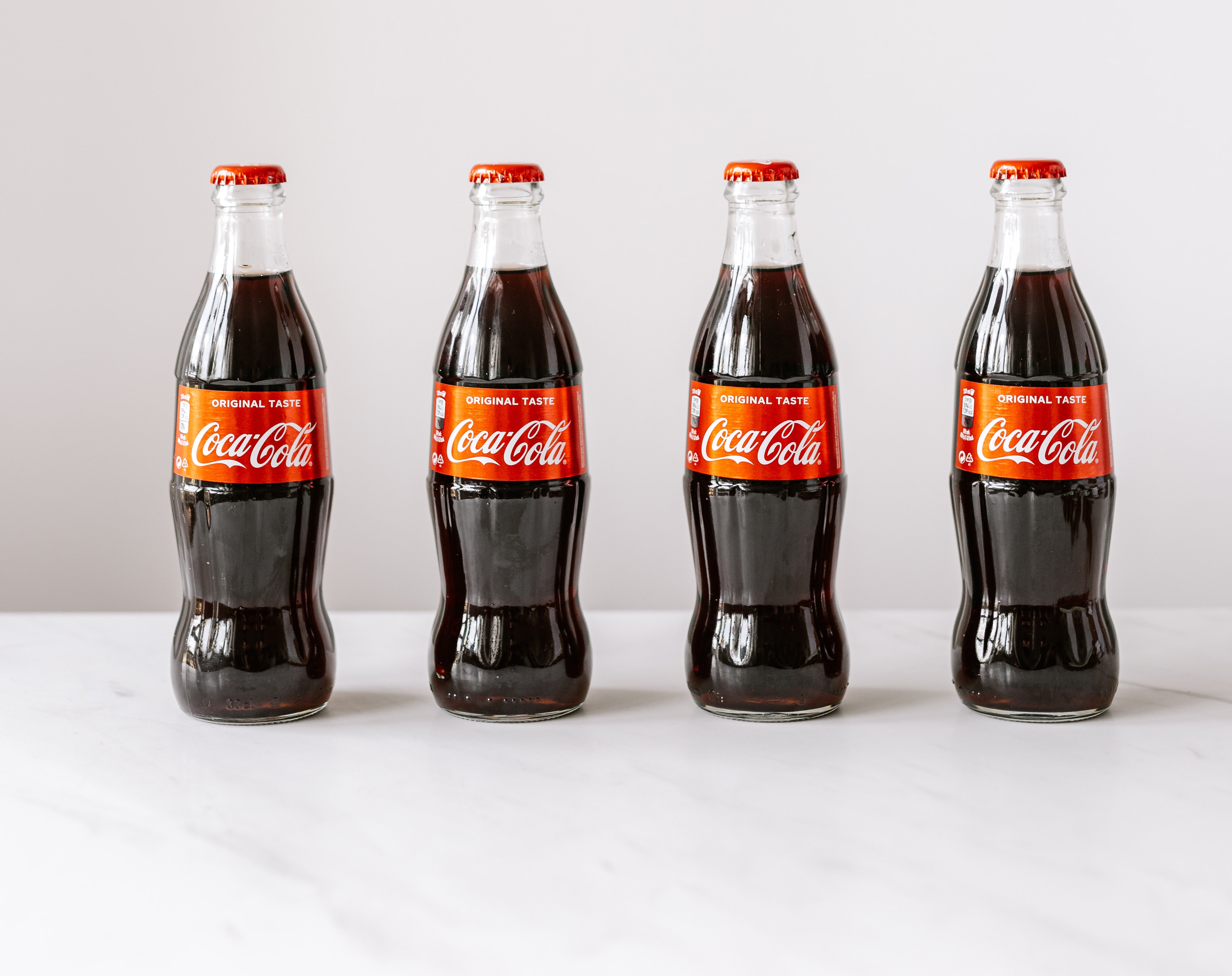
When you think of big iconic brands in your head, one of the first things you would visualise is the shape of their logo, then fill that in with the specific colours of that brand. We, as consumers, are overexposed to too many brands in our everyday lives, and brands need to find a way to cut through the noise in order to be noticed. Colours have an important role to play in that they fill in the gaps of recognisability when other aspects of their brand identity cannot.
Prominent colours used in branding can evoke specific emotions and affect people who view them in many different ways. These emotions are deliberately created to influence people who view them to drive decision-making.
Brands need to cultivate strong emotional connections with their audience and this can’t be done with just a logo.
Colours are needed to cultivate and build these emotional connections.

Moreover, repetition and consistent application of a brand’s colour(s) can strengthen brand recognition and awareness. If brands consistently use their colours, they become part of your brand in the eyes of your target market.
Choosing your brand colours can be overwhelming as you can choose from hundreds and thousands of different colour combinations. But we have made a basic set of guidelines that can help guide you in the right direction when creating your brand identity.
Picking your brand colours
When picking your brand colours, there are a number of things that need to be considered.
What is the type of industry that you are in? Who is your target audience? What mood do you want them to be when engaging with your products or your business? And what kind of business are you? These are some of the questions that need to be answered in order to give you a guideline when creating your brand’s colour palette.
The recommended number of colours that a brand needs is a maximum of 3 colours.
Any more than that would overcomplicate the brand identity and make it harder for customers to identify or emotionally resonate with your brand. When choosing these 3 colours, you will need to identify the base, accent and neutral schemes of the palette.

Base
When choosing your base, you need to determine the colour that anchors your brand personality. This main colour will not only be the base for your brand but also help you decide on your other brand colours.
Accent
The accent colour is used to complement your chosen base colour and will most likely be the 2nd most used colour in your brand identity. The colour must work well with the base colour to create cohesion, especially when presented to your target market.
Neutral
Your chosen neutral colour is most likely used as a background colour but doesn’t overwhelm both the base and accent colours. Your neutral colour would usually be much duller compared to other colours such as beige, grey, white or black.
Colour Palette
You should keep colour schemes in mind when choosing your brand palette. Brands usually use one of these common colour schemes: analogous, monochromatic, complementary, or triadic.
Analogous
Analogous colours are next to each other on the colour wheel and are usually easy on the eyes as these colours blend well with one another. This scheme doesn’t stand out as much compared to the other schemes but is good if you don’t want a very overwhelming palette.
Monochromatic
A monochromatic colour scheme will highlight and anchor your most dominant brand trait. This means choosing different shades of a specific colour in order to emphasise that brand’s personality trait.
Complementary
A complementary colour scheme is colours on the opposite sides of the colour wheel spectrum that look good together. They bring out the best in each other when they are paired and are good for stimulating customers when they see your brand.
Triadic
Triadic colour schemes use equal parts from three different sections of the colour wheel. Triadic schemes are safer for developing a brand palette but also offer a more stimulating and nuanced palette. These are some guidelines that can help you in your process when developing your brand colours.
This guide isn’t creatively restraining you but giving you a basic guideline. Research, experimentation and consistent application are what is needed in order for your brand colours to be successful in their job.
If you need help with your branding, such as creating your logo, collateral, or anything else, please don’t hesitate to reach out to us for a free consultation. We’re confident we can provide you with the assistance you need to take your brand to the next level.
Want to learn more about us? Check out Anomaly on DesignRush.
